


Repositioning and new branding for the Galfer brand
Redefinition of the visual identity and global strategy, highlighting the connection with high competition and innovation.
Context:
Galfer is a historic Spanish brand of high-quality brake components for bicycles and motorcycles. Today, it is one of the world leaders in the manufacturing and marketing of these products, with a presence in over 60 countries.
Galfer has stood out in the continuous development of innovative, high-performance products that are well-recognized in the market. Since its creation more than 70 years ago, the brand has always been linked to high-level competition across various categories of motorcycling and cycling.
Its brand identity has remained almost unchanged since then.
Challenge:
To redefine Galfer’s brand positioning, brand architecture, and visual identity to support the brand’s ambition for global growth, both in original equipment and, especially, in the aftermarket.
Solution:
Based on consumer research, we discovered that Galfer’s reputation and image were mainly built on the excellent product experience. However, the brand was not well-known among non-consumers and did not fully capitalize on its strong association with high-level competition, always linked to top performance in these product categories.
A strategic planning project was carried out to define its positioning, brand territory, and purpose. This formed the basis for building a strong, recognizable, and consistent global image aligned with the product reality and more closely associated with competition.
The “Brake like a pro” brand claim was proposed to inspire bicycle and motorcycle riders to push their limits and fully enjoy their passion, just like a true professional competitor.
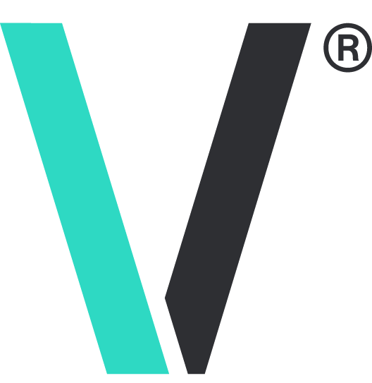
The new brand identity updates its branding with two fundamental objectives: restoring recognition and regaining visibility.
The updated, dynamic, and flowing branding, along with the adoption of a new brand color, “greellow,” achieves the initial goals. It allows the creation of a modern and powerful brand language, adaptable to any medium and application (packaging, point of sale, digital, social media…).
The new identity aligns the brand with the values of quality, technological innovation, competition, and leadership inherent to Galfer and prepares it for the new milestones the company is already working on.
Share project


